

 Åh, jeg har simpelthen så utroligt mange flotte, gamle editorials liggende på min computer, at I nok for en del at se til dem fremover. Denne gang står den på prints fra amerikansk Vogue, marts 1991, det selvsamme magasin jeg viste jer fantastiske colourblocking-billeder fra sidste gang, HER. Jeg er både ret glad for stylingen på disse billeder, men generelt er det baggrundene og opstillingerne på billederne og deres ret så lystige ydtryk der fanger mig. Især de første tre billeder er jeg virkelig glad for – stylingen på det første og farven på bilen spiller så fint sammen og farverne og glæden på det andet er så dejligt. Jeg er ikke særlig hooked på stylingen på det tredje billede, men i selskab med de andre farver og situationen på billedet er det virkelig ok. Mh, jeg kunne blive ved, jeg elsker det. Hvilket billede er jeres yndlings?
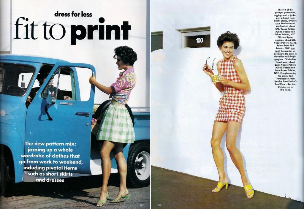
Oh, I’ve got soo many gorgeous, old editorials on my computer, so you will probably see lots more of these from now on. This time the theme is prints and the editorial is from American Vogue, march 1991, the very same magazine I showed you wonderful colourblocking photos from the last time, HERE. I’m both very fond of the styling on these photos, but in general it’s actually the backgrounds, scenarios and happy expressions that intrigue me. Especially the first three photos are my faves – the styling on the first photo and thee colour of the car go so well together and the colours and the joy of the second one are phenomenal as well. I’m not really that hooked on the styling of the third photo, but accompanied by the settings, colours and the scenario on the photo, everything works perfectly together. Mh, I could go on for hours, I just love it. Which photo is your fave?