

 Som jeg fortalte HER har jeg fundet en hulens masse fantastiske editorials fra gamle blade og her er den første portion: colourblocking fra amerikansk Vogue, anno 1991. Slet, SLET ikke dårligt i min mening. Jeg elsker hvordan farven på væggen, tøjet, døren og modellens hud harmonerer fortræffeligt på det første billede – og så er kompositionen også bare formidabel. Det andet billede er jeg både vild med grundet farvesammensætningerne i de to modellers outfits – hvilket også gælder for de sidste to billeder – og så det fine scenarie, der udspiller sig. De sidste to billeder.. ja, hvad kan man sige? Jeg elsker farverne! Jeg satte dem op sammen, fordi jeg tænker at rød, pink og grøn balancerer hinanden så nydeligt ud og modellernes poseringer er på hver sin måde ret så skønne! Hvad synes I om den fine, gamle mode?
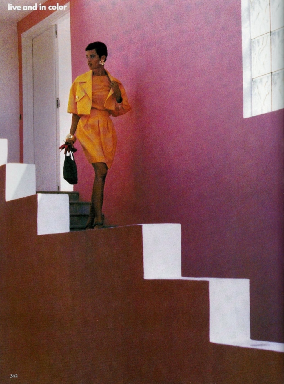
As I told you about HERE, I recently found a hell of a lot of great editorials from old magazines and here’s the first bit, I want to show you: colourblocking from American Vogue, anno 1991. Not bad, NOT BAD at all, if you ask me. I love how the colour of the wall, the clothes, the door and the model’s skin join in such a perfect harmony on the first photo – an the composition is formidable as well. I like the second picture both because of the colour combos – which also shows in the two last pictures – and the cute scenario being played. The last tho shots.. well, what can one say? I love the colours! I put those to right by each other, since I think that red, pink and green balance each other out very delightfully and the poses of the models are so fresh in each way! How do you like this old, nice fashion?