Now that we’ve gone through the stuff to think about when shooting your outfit photos and street style shots, I thinks it’s quite appropriate to get around to somehitng very important – tips for what to do when the photos are taken and ready to get even better. I’ll be taking you through some simple editing methods that I use, when I edit in GiMP, one of the best free editing programmes out there, which can be downloaded HERE. Let’s get to it!
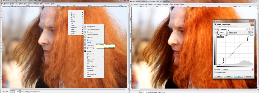
1: KNOW YOUR CURVES
If you really want to be able to control stuff about your photos, curves is the way to go. With the “Value”-curve(the first curve-diagram to pop up, when you open curves) in GiMP and most other programs, you can see how many pixels in the photo that are light and dark pixels. By pulling the curve, you can control these pixels to make them even darker or lighter. Usually an S-curve, which is shown on the photo below, goes quite well with all photos to make the light and contrasts even nicer and more crisp.

In this shot, Grace Coddingtons red hair is quite prominent, so I want to enhance the red pixels to make the color pop even more. I chose “red” on the drop down menu in the curve window and there I can manipulate the red pixels in the photo, like i could with the light and dark pixels in the previous curve diagram. Here I can pull the curve and make the pixels more or less red.

Now that I’ve pulled the curves how I wanted them, I press OK and end up with quite a difference in the before and after shot: better contrasts, shinier light and bold red colors, just like I wanted.

You can also make colors less prominent in curves, which I needed to do after having made my light and dark value curve of this photo:
I think the photo turned out too blue, so I went to the blue curve and pulled the curve down a bit. Then my face and hair in the photo go kind of green, so I go to the green curve and pull that down a bit as well.

I think the photo turned out a bit gloomy and dark, so I went back to my value curve and did a little s-curve again to make the colors more crisp.

Now I’m happy about my photo – I press OK and end up with a more contrasty photo with brighter colors and a nicer light.
2: CROP TO THE TOP
Not all photos need to be cropped, like the two you’ve seen above – but sometimes a bit of a crop can improve a photo, like these ones:
In this shot, I think the background is too busy and take attention away from the man’s suit, which is the main player of the shot, so I crop off as I can of the people’s legs while trying to get as much of the suit to be in the shot still.

In jumping shots, you might also want to crop off the ground, if it’s possible, so that you get a bigger effect of the jump. On this shot I think the crop makes the photo a bit more calm and elegant to look at, and it makes the photo less “much” to look at – the easier for the eye to look at, the better!

Stay tuned for next week, when I’ll take you on a small tour of the paid editing program Adobe Lightroom!