

 photo source: fashion gone rogue
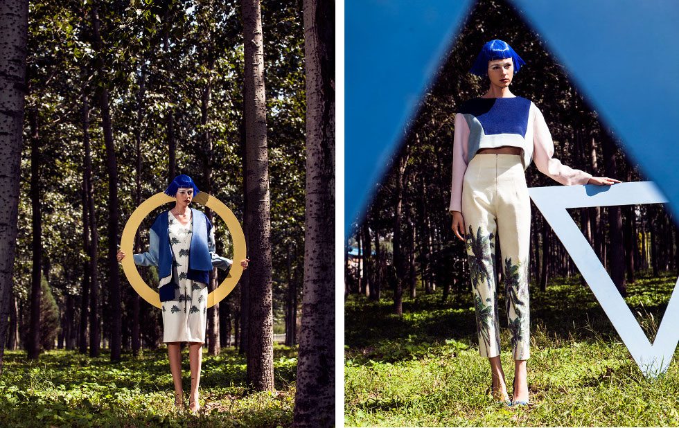
Hvis der er noget, jeg er en sucker for, så er det kontraster. Kontraster hvad angår former, temaer, farver. Kontraster, som alle indgår i denne storslåede billedserie fra Fashion Gone Rogue. Den formmæssige kontrast er noget af det første, jeg lagde mærke til – trekanter mod cirkler og dermed menneskeskabte, lidt for præcise geometriske former mod naturens organiske og ukontrollerbare former. Tema-kontrasten er nogenlunde åbenbar herefter: det menneskeskabte og unaturlige op imod, ja, naturen. Blå og pink parykker og skarpe linjer, der kontrasterer skoven ret tydeligt. Og sidst, men ikke mindst, har vi farverne, der er så skarpe og klare, at de nærmest ser kunstige ud overfor farvespillet i træerne og græsset. Jeg elsker det – kunstigt overfor organisk, mums! Hvad synes I om billederne?
If there’s a thing I’m completely in awe of, it’s contrasts. Contrasts when it comes to shapes, themes and colors. Contrasts, which all appear in this magnificent editorial from Fashion Gone Rogue. The contrast in shapes is something I noticed as the first thing – triangles versus circles and human made, a bit too precise geometrical shapes versus the organic and uncontrollable shapes of nature. The contrast in there is quite obvious now: the human made and unnatural versus, well yeah, nature. Blue and pink wigs and shape lines that contrast the forest quite a lot. And last but not least, there’s the colors that are so bright and crisp, that they almost look artificial next to the play of colors in the trees and the grass. I love it – artificial versus organic, yum! How do you like the photos?